0 to 1 service design for omnichannel retail
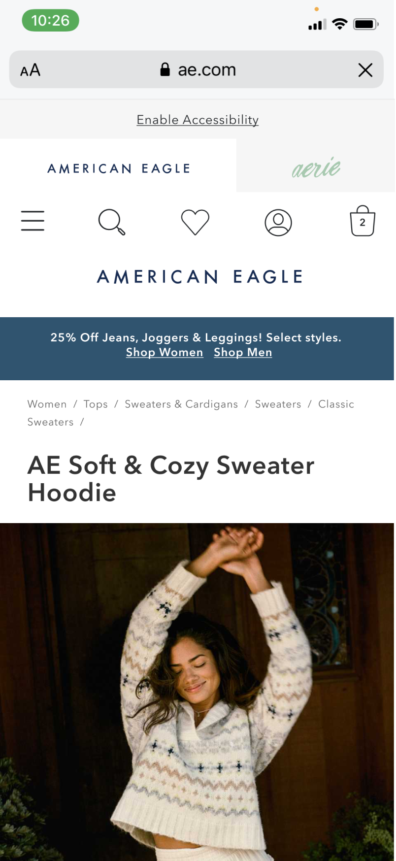
Led a major cross-functional initiative to develop and launch a new in-store pickup channel for American Eagle and Aerie, unlocking customer convenience and streamlining order fulfillment.
Generated Revenue
Picked-up dollars + attached in-store sales.
Fulfillment Rate
Overall pick-up success rate.
Locations Scaled
BOPIS-enabled stores across U.S. + Canada.
The Problem
American Eagle and Aerie’s legacy "Reserve, Try, Buy" program let customers reserve items without paying upfront. But with no financial commitment and unclear pickup logistics, the system buckled under its own weight.
It hit a staggering 69% abandonment rate and left over 223,000 uncollected units sitting in stockrooms. The fix was a real Buy Online Pickup In-Store (BOPIS) system.
Leading Discovery
When a new design director arrived, brought over from product management, I was the first person he pulled in. The mandate was experience discovery. What was Reserve, Try, Buy actually telling us, what needed fixing immediately, and what could the new system not afford to repeat.
I partnered with UX research, rode along on store shopalongs, and interviewed customers and store associates directly. And I didn't wait for a tidy findings report. I put my designer to work ideating and prototyping while the insights were still fresh.
Dual-Track Mapping
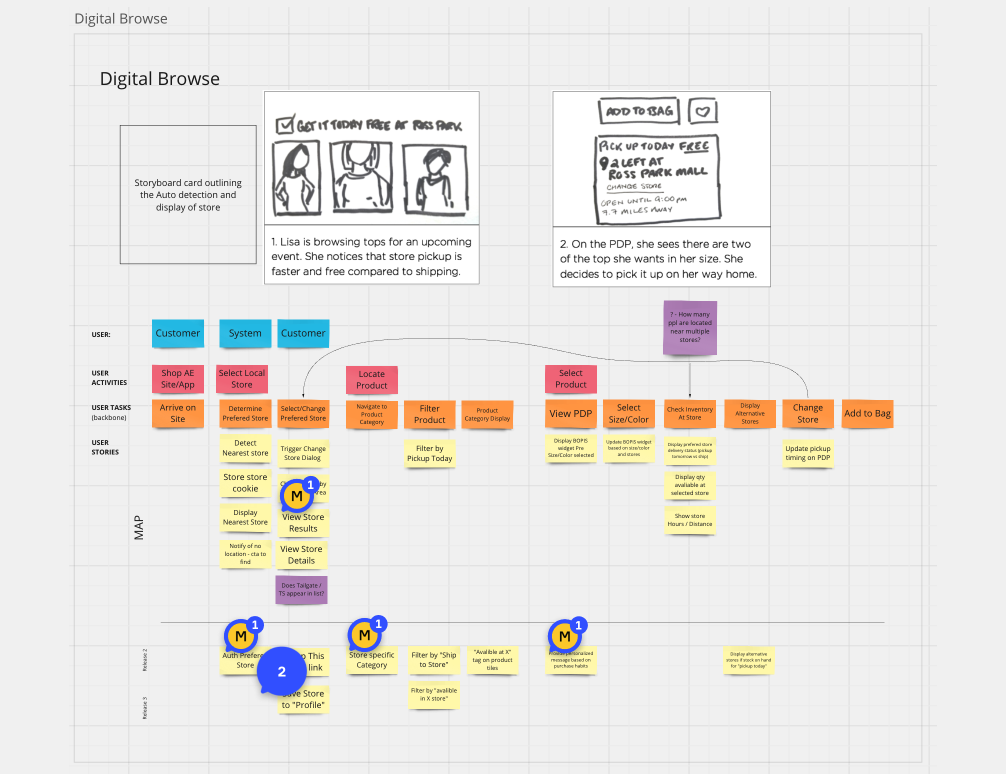
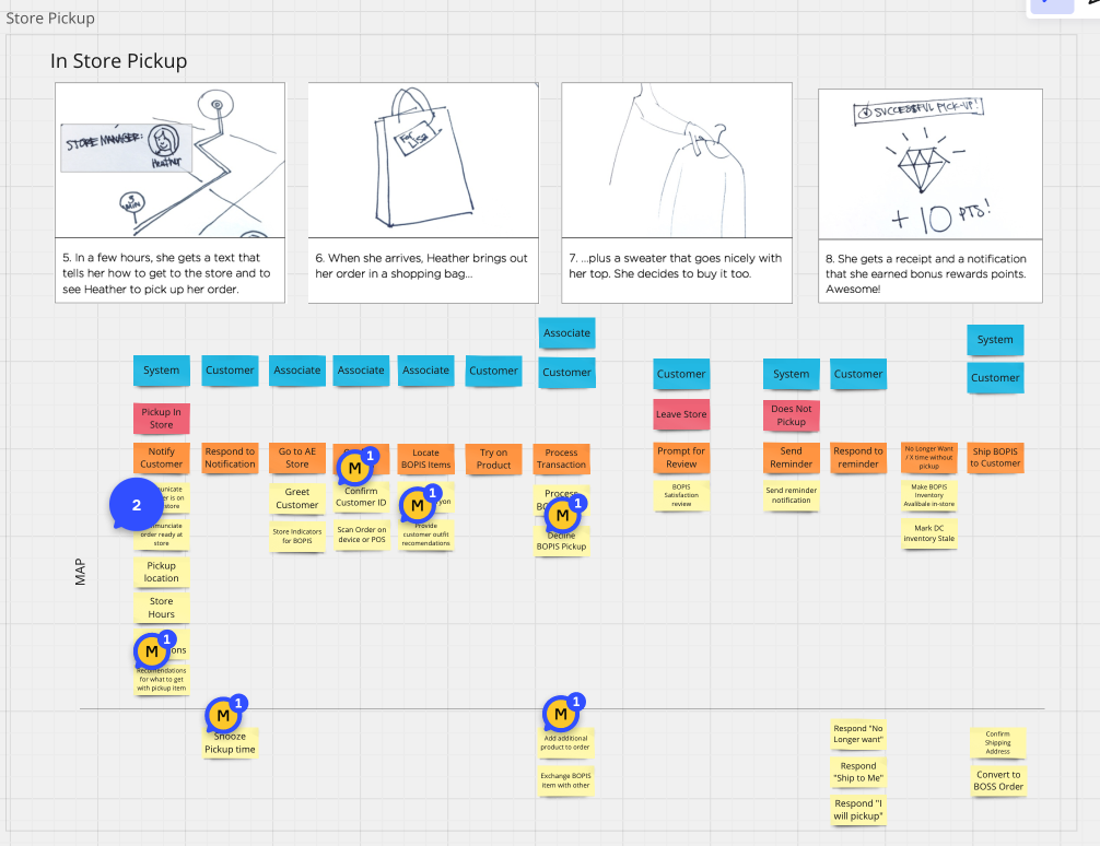
Designing for omnichannel means holding two realities at once. I needed the digital interface to mirror the physical constraints of the stores: stockroom logistics, associate workflows, the moments where digital intent meets physical fulfillment. To make sense of it, I introduced dual-track story mapping.
The Digital Browse track mapped the on-screen user stories. The Store Pickup track ran in parallel, orchestrating the physical fulfillment process for both customers and retail associates.
The Service Blueprint
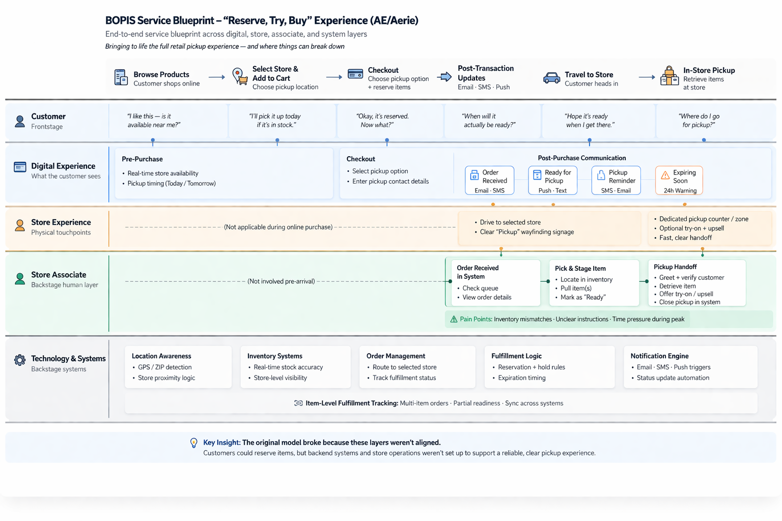
The story maps fed a full service blueprint spanning five layers: the customer journey, the digital experience, the physical store experience, the associate workflow behind the counter, and the systems underneath it all.
Laying the layers side by side surfaced the core diagnosis. Reserve, Try, Buy didn't fail because of any single screen. It failed because these layers were never aligned. Customers could reserve items, but the backend systems and store operations weren't built to deliver a reliable pickup. The blueprint became our shared map for fixing all five layers at once.
Friction as Fuel
Our first prototypes landed with hesitation, and honestly, fair enough. We had only just begun collaborating with the teams who owned the physical half of this experience. I made a deliberate choice to treat that friction as fuel rather than a fight.
When we had to stand firm on a design decision, I showed the why with grace. Prototypes did the heavy lifting, letting people feel the experience instead of debating screenshots. And I kept my director informed at every step, so when a decision needed organizational weight behind it, he could escalate without missing a beat.
Pilot & Scale
With the wireframes as our blueprint, I led iterative prototype testing to stress-test and refine the solutions. But a digital prototype can only simulate so much of a physical logistics problem, and holiday season was bearing down on us. The iterative pilot was our pressure valve. Ship something real, learn from it, build on it.
After validating the initial design, American Eagle and Aerie launched an early rollout pilot program across four stores in the Pittsburgh area.
Those four stores surfaced what no prototype could. Associates' pickup notifications weren't cutting through, so we drove a fix with the internal systems team. Customers wanted to know how long orders would be held and what happened if they never came, so we built those answers into the flow. Every fix earned more trust from store ops, and they increasingly let us run.
Speed Over Proximity
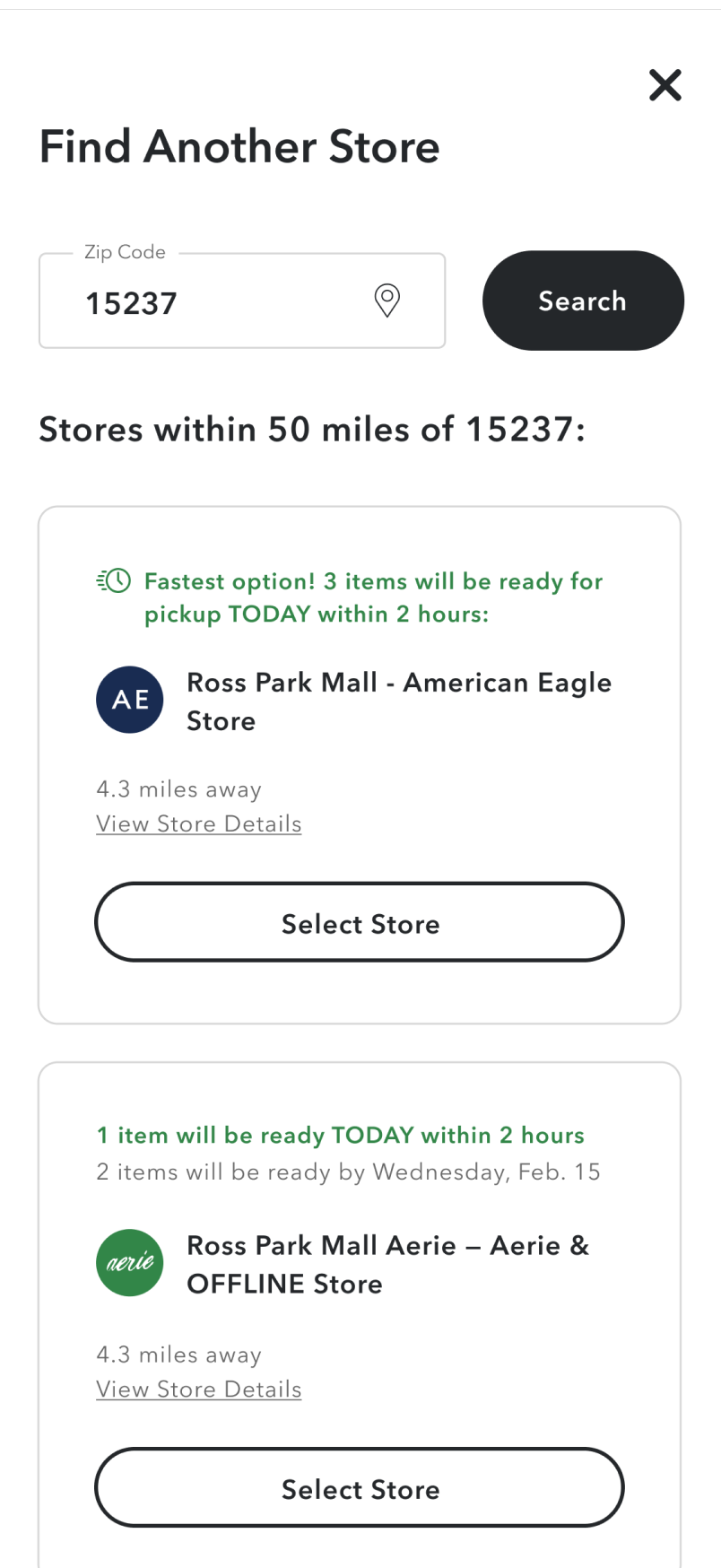
Early on, the system did the obvious thing. It defaulted customers to the store closest to them. That made sense on paper, but the data told a different story. The nearest store often wasn't the one that could actually fulfill the order fastest.
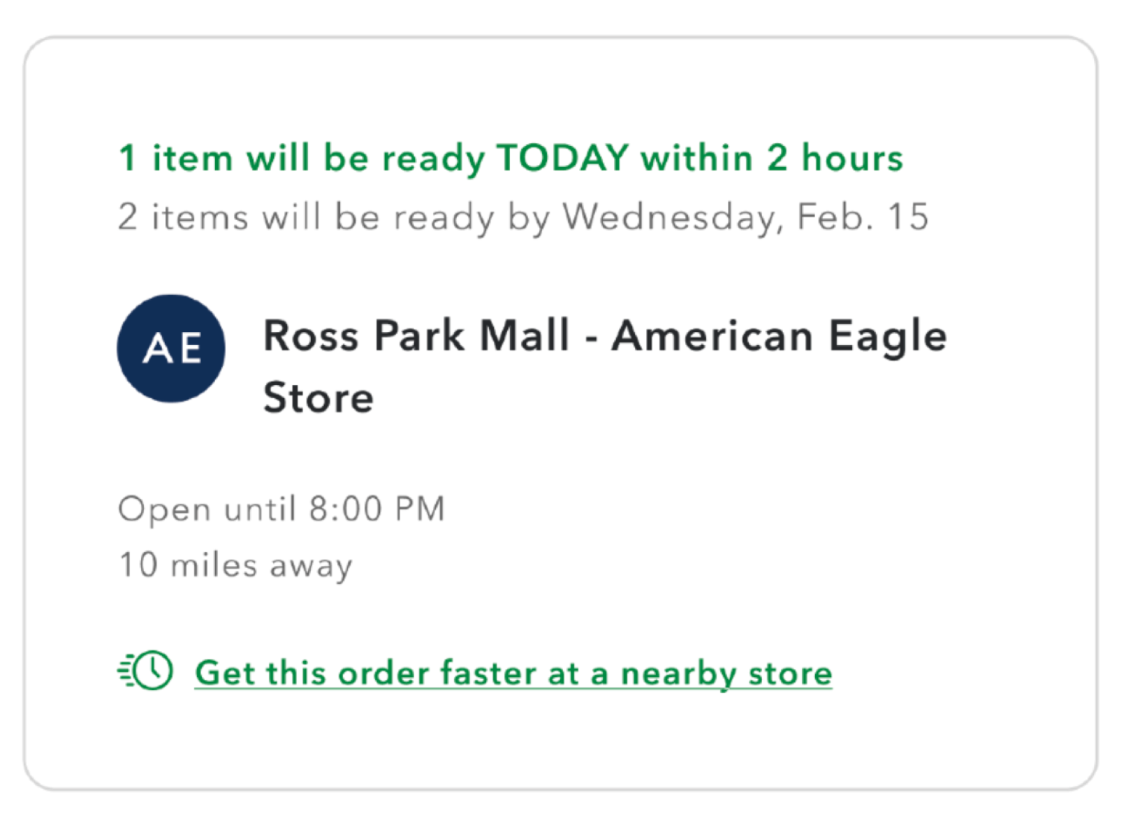
I caught it in a prototype usability study I ran with my researcher. Our product partner was hesitant to change the logic, and reasonably so. Distance felt like the obvious default. But the finding was definitive. Customers would happily drive a little farther when it meant getting their order in hand sooner. Once she saw that, she made the change with full confidence. We reframed the logic from "nearest store" to "fastest available pickup," and surfaced a clear prompt that let customers trade a few extra miles for same-day speed.
The shift paid off on both sides of the equation. Same-day pickup volume went up, and routing orders to stores with available inventory brought fulfillment costs down.
The Final Experience
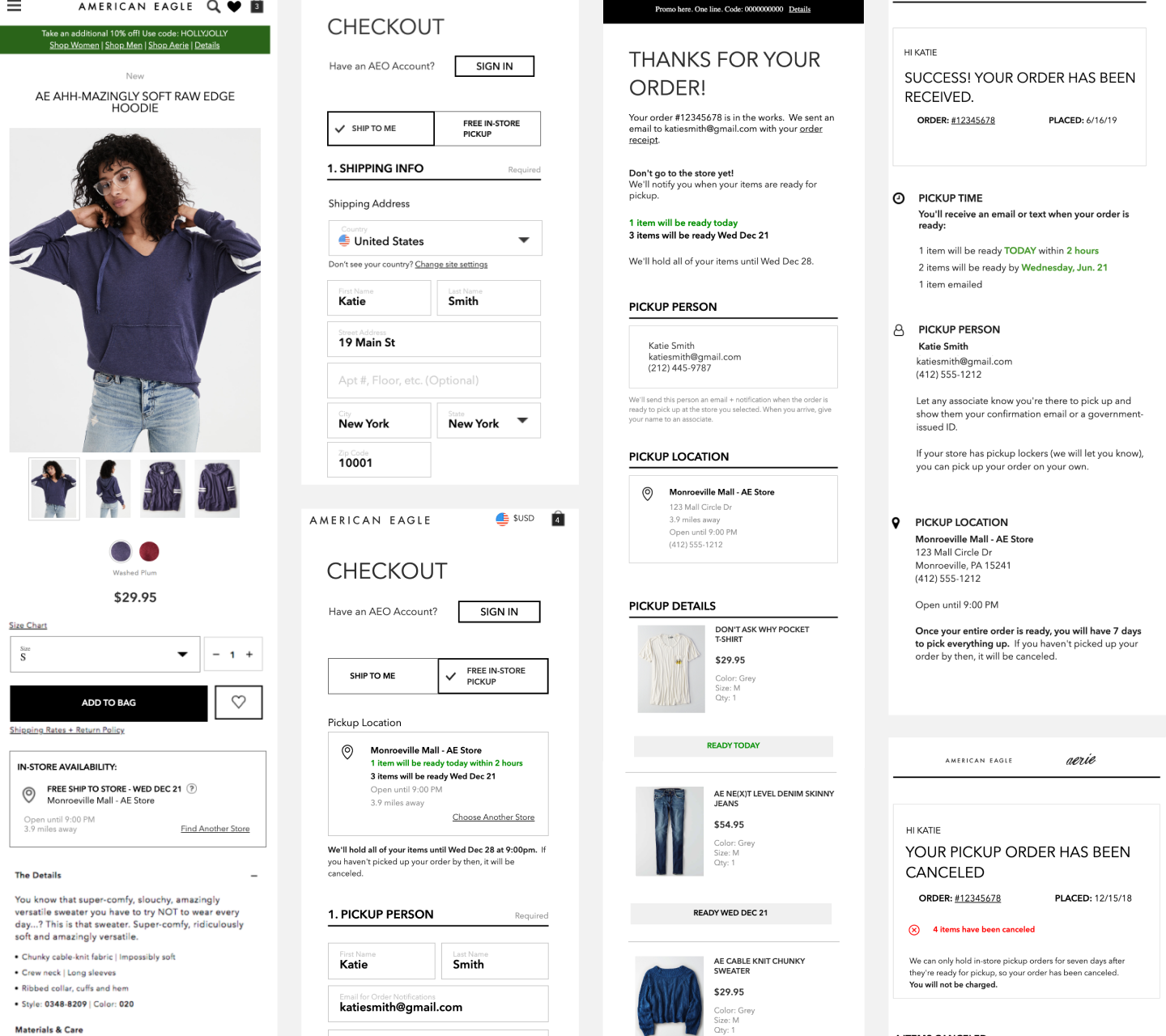
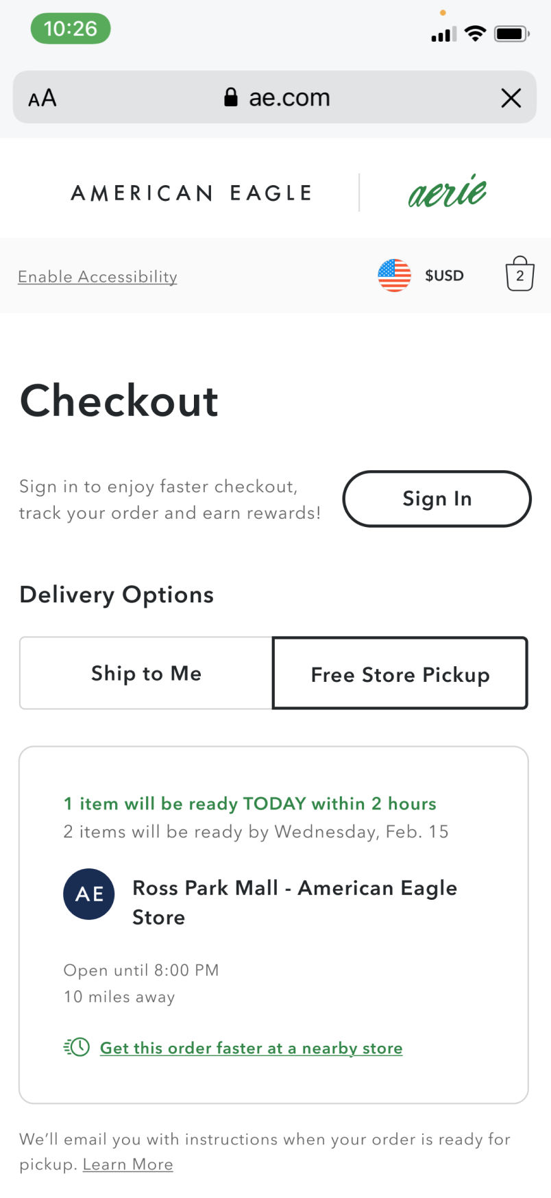
With the architecture validated by the pilot, I turned to the final experience. The goal was a checkout flow that felt effortless rather than transactional.
I prioritized clarity at every hand-off, so customers always knew when, where, and how to pick up their order without contacting support or second-guessing the timeline.
Post-Launch Evolution
Shipping the initial BOPIS experience was a major milestone, but I designed the underlying architecture to grow. A good service design doesn't just solve the immediate problem. It creates the scaffolding for what comes next.
Post-launch, I set up a continuous research loop to keep the product honest. That loop directly shaped later rollouts, including In-Store Mode and a native integration for Curbside Pickup.
Where It Fell Short
The one that got away was item-level fulfillment. I wanted a customer to pick up what was ready today and have the rest of the order shipped home, all in one seamless transaction. The operational complexity meant we had to settle for ship to store on the remaining items.
It works, but it isn't the experience I was chasing. It's the first thing I'd fund if I went back.
Key Takeaways
- • The screen is only half the experience. I came into this project thinking about flows and interfaces. I left it thinking about stockrooms, associate workflows, and the moment a customer walks through the door. Omnichannel means designing all of it.
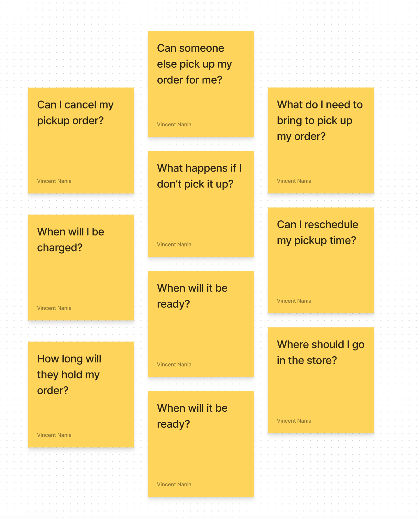
- • Answer the anxious questions first. The research kept surfacing the same grey-area fears: who can pick up my order, where do I go in the store. Addressing those upfront was what moved the abandonment rate.
- • Four stores taught me more than any prototype. The Pittsburgh pilot surfaced edge cases no wireframe could have predicted. I'd never skip a physical pilot again.
Strategic Horizon
- • I'd want to close the loop between physical pickup data and the digital hand-off. There's signal in that moment that could meaningfully shape the confirmation and notification flows.
- • The 84% fulfillment rate is strong, but I'd want to understand the 16%. Is it a store operations issue, a communication gap, or something in the digital flow that's setting the wrong expectation?
- • The ready-for-pickup notification is doing a lot of work right now. I think there's a smarter version of it: one that factors in store hours, estimated wait times, and order hold windows so customers always show up at the right moment.
See the experience in action
Explore the American Eagle site to see the checkout and store pickup flows live.