Skim, Dip, Dive: Re-architecting the L1 mobile experience
How a centralized navigation framework transformed a dense, fragmented application into an intuitive pathfinder system. This initiative drove a 60% engagement lift while protecting long-term design governance.
Monthly Engagement
Sustained across active app users.
iOS App Store Rating
Accompanied by 4.8 on Google Play.
Ecosystem Impressions
Spurring 1M+ unique ecosystem sub-visits.
The Problem
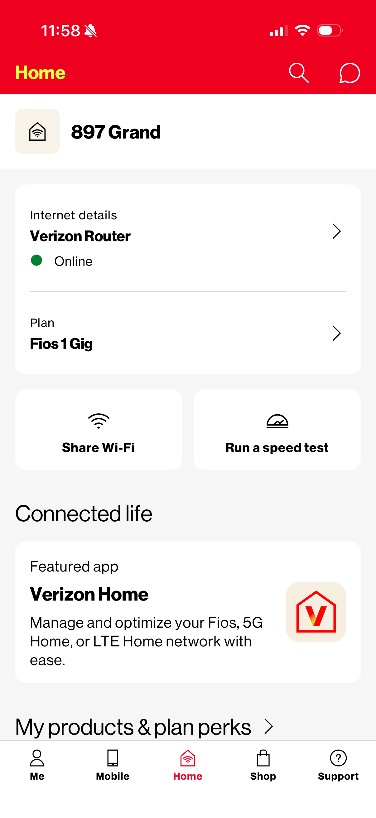
The legacy My Verizon application had become a victim of its own ambition. Handling everything from billing to connected-home management, it had turned into an aggregation point for competing internal priorities. Each team surfaced their work at the top layer, with no one governing the whole.
The result was predictable. Feature bloat buried intuitive paths, suppressed revenue discovery, and spiked support contacts. The app needed a hierarchy, not more features.
Defining the Problem
Before I could fix the L1, I had to define what was actually broken. I pulled together workshop outputs, historical research, stakeholder interviews, and customer feedback, and the noise resolved into six recurring themes.
These six became the lens for every decision that followed, and the rubric the Skim, Dip, Dive framework had to answer to.
Governance Model
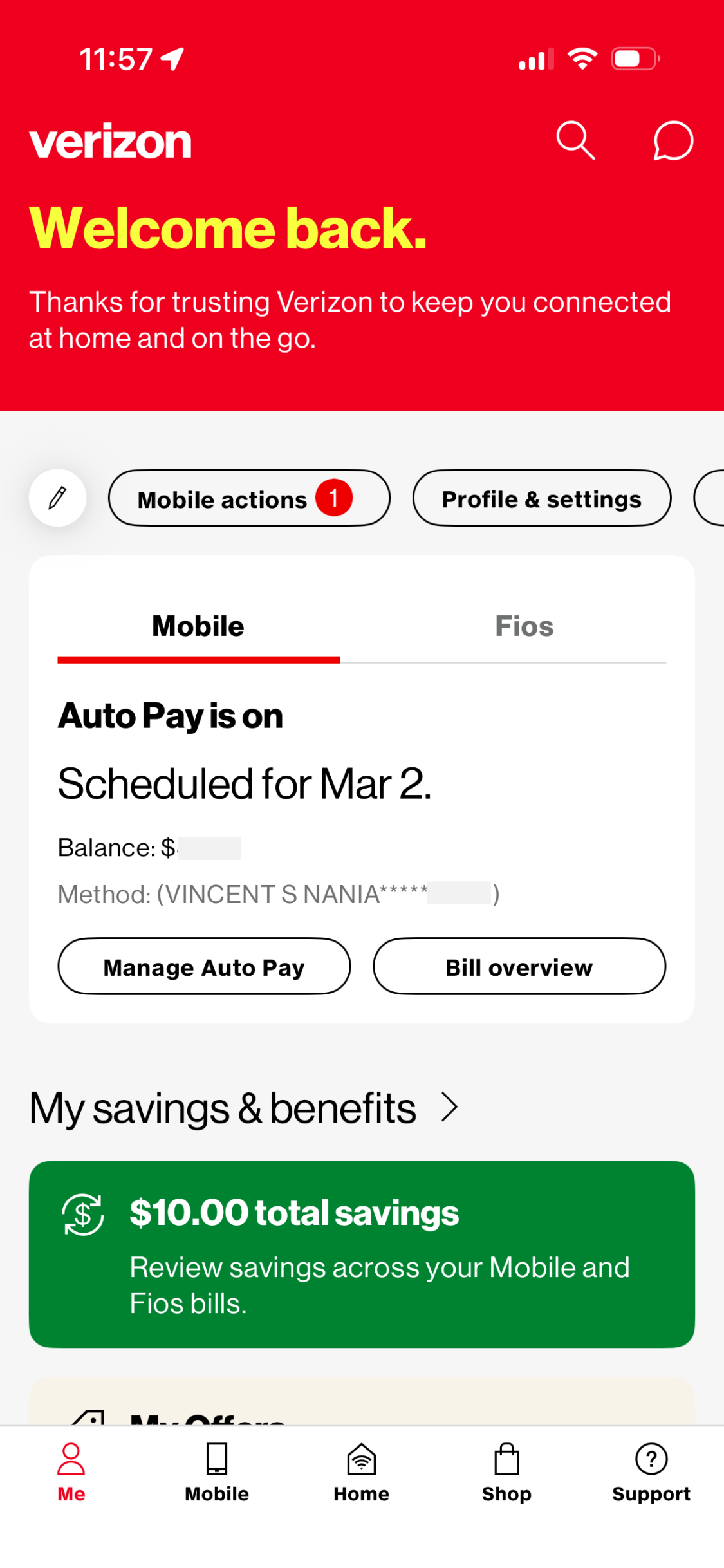
The answer was the "Skim, Dip, Dive" architecture, a framework my director introduced and I helped shape in the earliest brainstorms. It reframes the home dashboard not as a final destination, but as an information processing strategy. Customers work through a dense product one intentional layer at a time.
To prove it was more than a nice diagram, I mapped our entire legacy app and website against the framework, screen by screen. That exercise pressure-tested it against every edge case we had, and it became the evidence my director and I used to sell the model to product and business stakeholders.
That meant treating it as a governance tool, not just a design pattern. I set clear rules for what belonged at the Skim layer versus the Dive level, giving teams an objective lens for new feature requests and making it harder to bloat the L1 for any one priority.
Holding the Line
Governance gets tested fast. The Offers team pushed to place a promotion, Add a Line, into the L1 shortcuts, and their product manager fought hard for it. The shortcuts existed to get customers where they needed to go. The moment they became ad space, the whole layer would stop earning trust. Instead of arguing taste, I pointed at the framework we had all signed up for. Shortcuts are navigation. Offers live where customers shop. The rules held, the promotion found a better home, and the precedent protected L1 from the next dozen requests just like it.
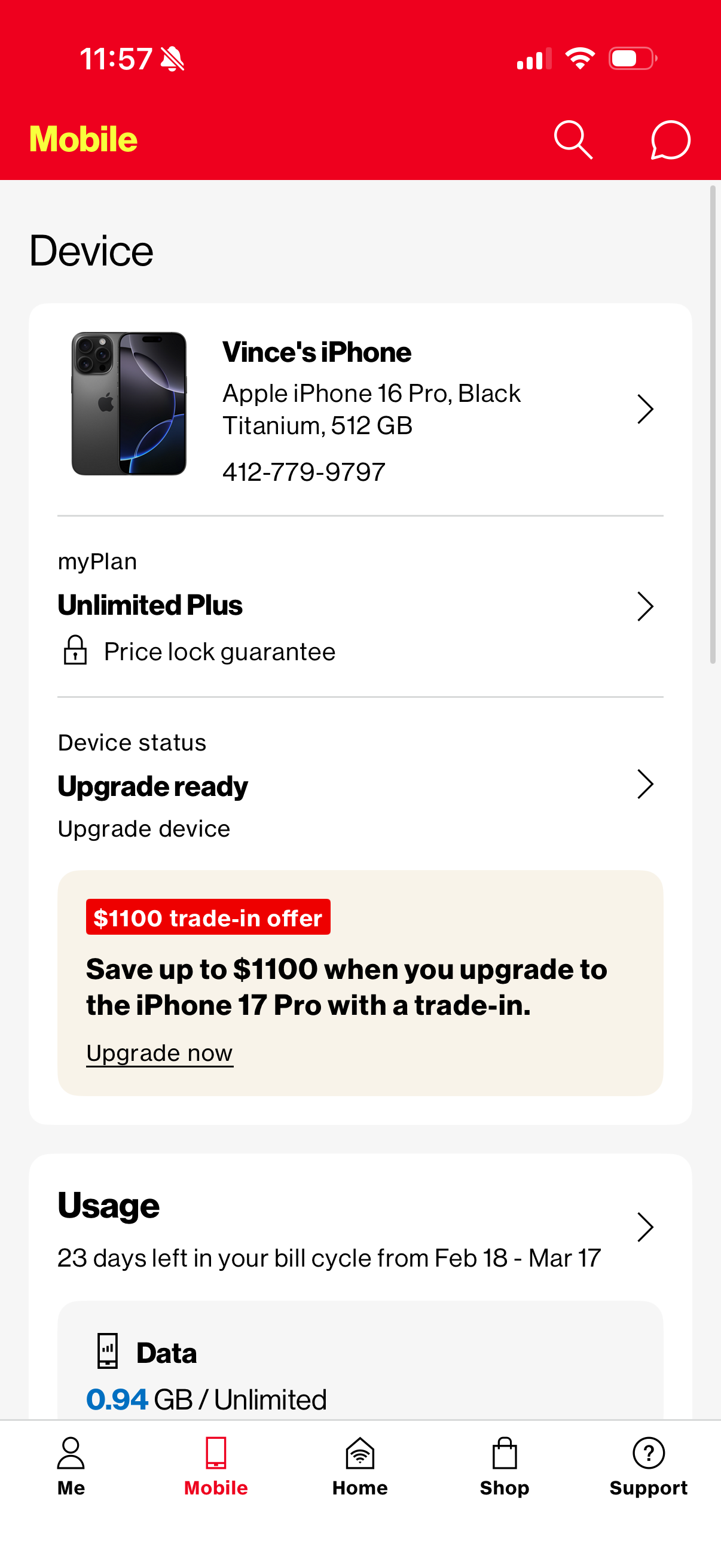
Another test came on the Mobile tab. Stakeholders wanted every subtitle under usage to be tappable. It sounded like added utility, but every one of those taps led to the same destination, because the L2 that would justify them didn't exist yet. Rather than explain that on a slide, I built a working prototype and let stakeholders feel the dead end for themselves. Tapping four different labels and landing in the same place made the argument in about thirty seconds. We shipped the honest version.
Alignment
Shipping this required me to work across three organizational fronts at once. The design work was only part of the job.
I reframed our UX work in the language of growth metrics that product managers already owned. That translation shifted conversations away from "whose feature gets surfaced" and toward shared structural outcomes, which made it a lot harder to argue against.
The framework needed patterns the global design system didn't have. Instead of asking for exceptions in the abstract, I built the experience twice. Once with out-of-box components, limitations on full display, and once with a lightly customized version. Seeing them side by side ended the debate. The customized patterns shipped, and the system team appended them to the global library.
I worked closely with engineering to find frontend solutions that could support the new layout model without taking on performance debt. Some of the best decisions in the final product came directly out of those technical conversations.
Where It Fell Short
I'd rather name this than pretend the framework fixed everything. The L1 came out tight, but we never had the capacity to rework L2 with the same rigor. Some of that layer still carries redundancies and design waste that teams are working through today.
Skim, Dip, Dive set the standard. The layers below it still have to earn it, and that's the honest cost of shipping a framework with finite capacity.
Key Takeaways
- • Reducing noise at the top is a growth lever. Every time we cleared L1 clutter, completion rates went up downstream. It wasn't subtle.
- • A shared framework is a negotiation tool. Having Skim, Dip, Dive on the table meant feature prioritization conversations had an anchor. That changed everything.
- • Simplicity needs a guardian. The hardest part of this project wasn't designing the system. It was making sure it didn't quietly erode once we shipped it.
Strategic Horizon
- • I'd want to go deeper on behavioral data: which L1 features are actually earning their spot based on what users do, not just what teams ask for.
- • There's an opportunity to make the layout feel more personal without fracturing the core hierarchy. Contextual states based on account activity feel like the right next layer.
- • Skim, Dip, Dive shouldn't live only in the app. I'd love to see it become a shared mental model across the broader Verizon ecosystem.
See the experience in action
Explore the My Verizon app on the iOS App Store to see the core interface transformations live.