Conversational UX on a zero-dollar budget
How a scrappy, interactive FAQ proved the value of conversational design and secured funding for a fully scaled automated support ecosystem.
Chat Volume
Reduction in chat contacts
Total Volume
Reduction in overall contacts
Cost Savings
Saved per deflected chat
The Constraint
Users were drowning in a dense, static FAQ section, generating a flood of easily avoidable support tickets. A conversational experience was the obvious answer. But when I raised it, product, business, and even my own design manager said no. There was zero budget, and the only option anyone would entertain was a third-party, out-of-the-box chatbot. At the time, those were genuinely bad.
Here's what I knew that hadn't landed yet. Retail support needs aren't that complex. People want their clothes at a fair price, delivered quickly, fitting well. The same questions surfaced over and over across thousands of contacts. We didn't need machine learning. We needed a relentless focus on information architecture.
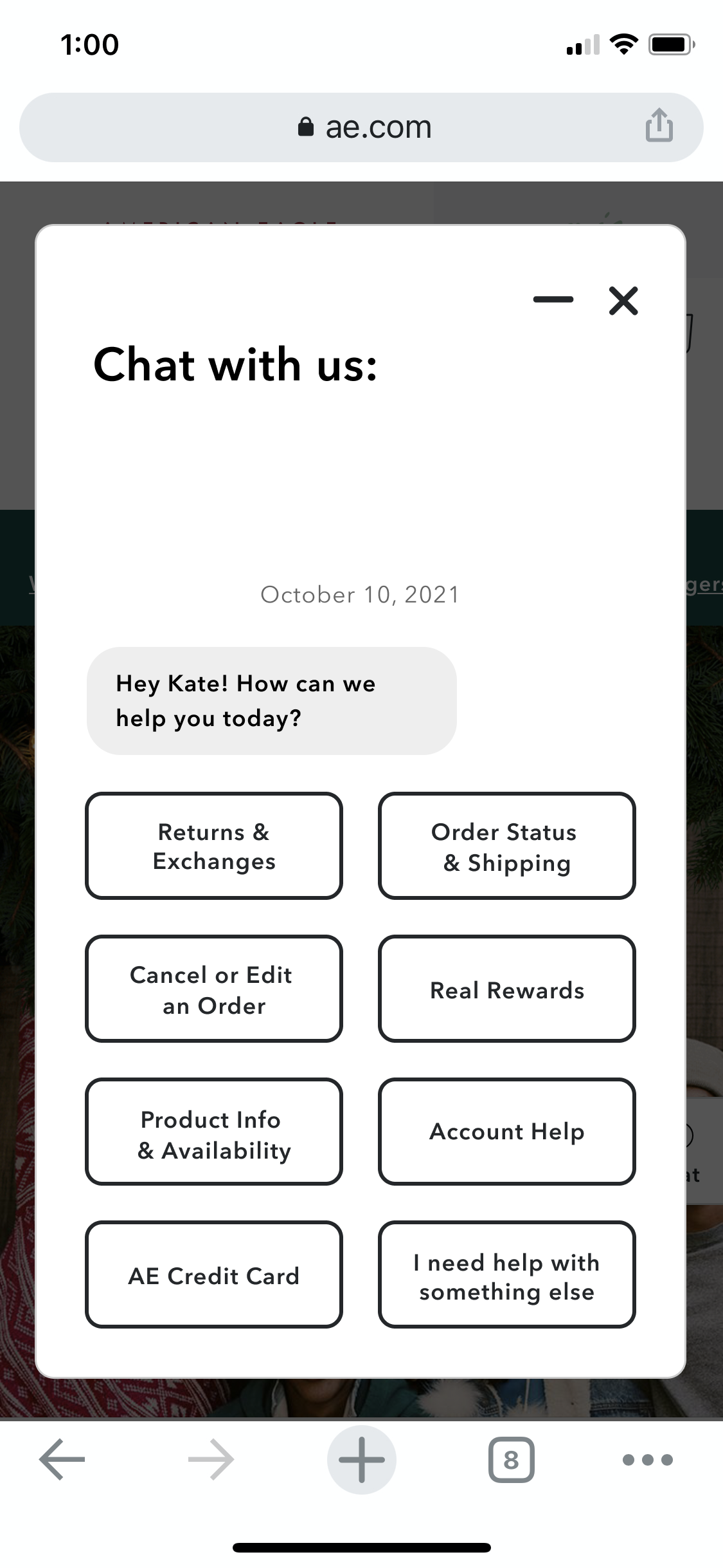
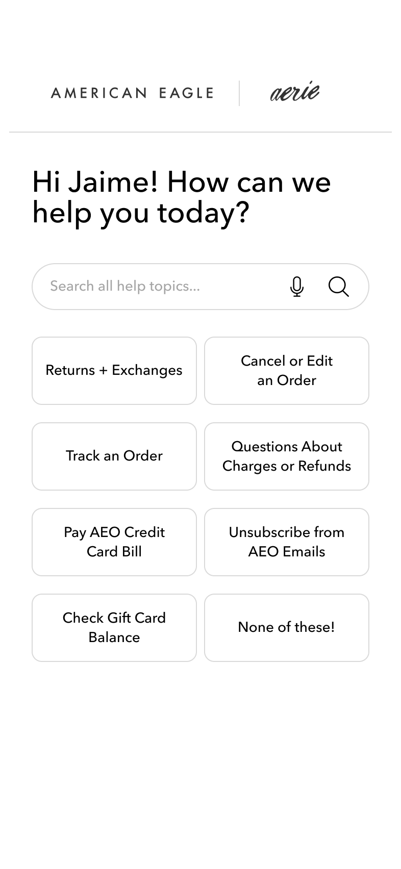
So I didn't wait. I built the "Trojan Horse" prototype myself, an interactive FAQ that mapped our existing static content into a guided decision tree, simulating a conversational experience at virtually no cost. Then I pitched my design manager with an ironclad story about cost and call-volume reduction. I made myself undeniable. She said it had legs, we took the same pitch to product and business, and it worked.
The Stakeholder Bridge
Customer Support could have been skeptics. Instead, they became co-authors. I gave them the same pitch and they got genuinely excited, so I involved them at every step, with daily calls to craft the conversational content together. I kept those calls loose and fun on purpose. Style, grace, and a few good jokes move projects too.
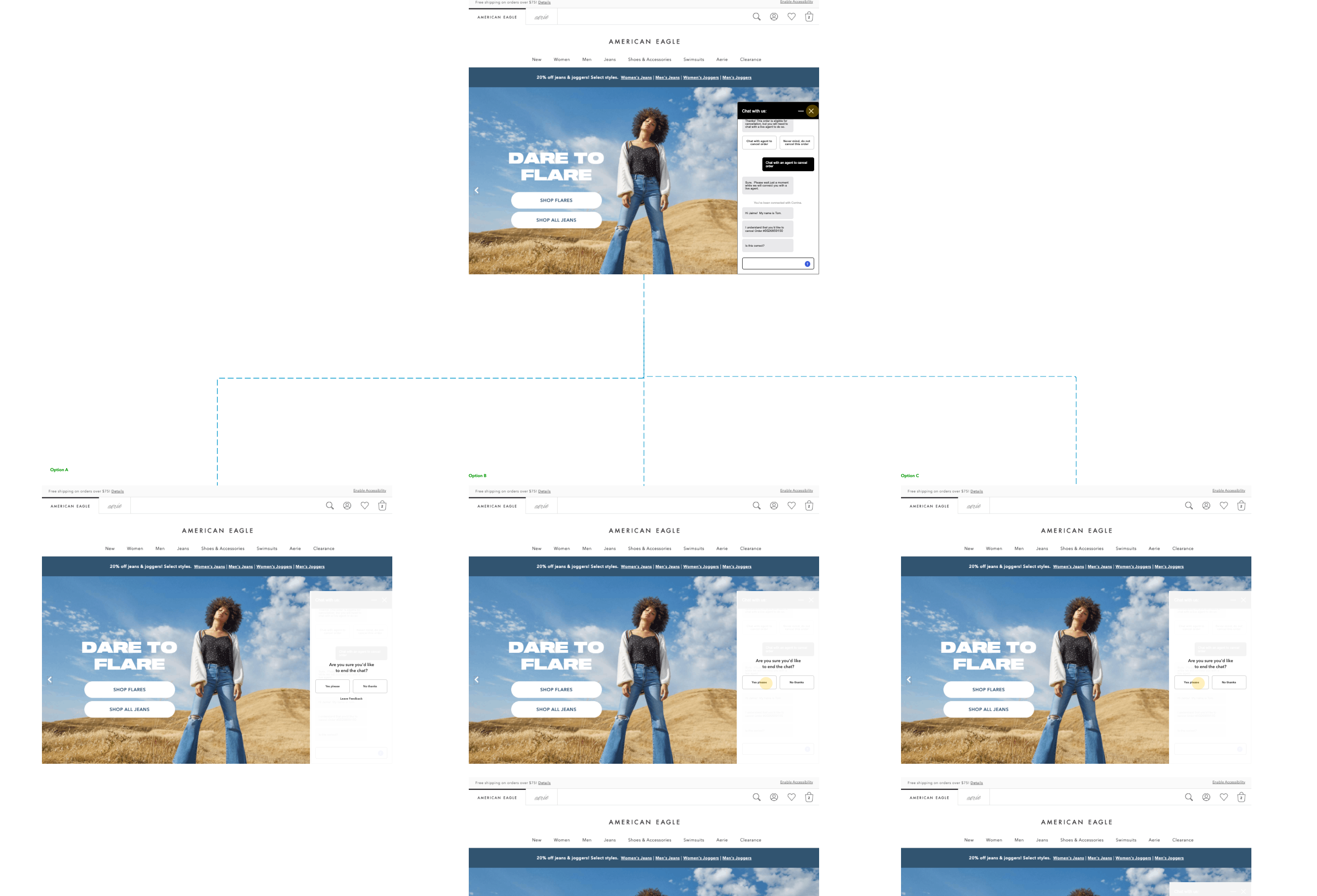
To align on complex behaviors like "Close Chat" triggers, I moved away from abstract discussions. I used this "choose your adventure" wireframe model to socialize options directly with those same stakeholders.
It gave stakeholders something real to react to. They could feel the decision logic in real time, which moved the conversation from subjective debate to concrete tradeoffs. That was the catalyst for final consensus.
“Our online FAQ has been fantastic for our site... Each chat contact costs us $5.00, so a reduction that significant is huge. And it’s seen as a shiny, cheap feature!”
The Scale
One month of live data changed everything. The numbers at the top of this page stopped being projections, and leadership's posture flipped from "the FAQ thing" to "what do you need." In a single stroke, the tool was validated, enhancements were greenlit, and I'd earned a reputation as someone who could make something from nothing. That leverage became the budget to design and build a custom, fully integrated chatbot in-house.
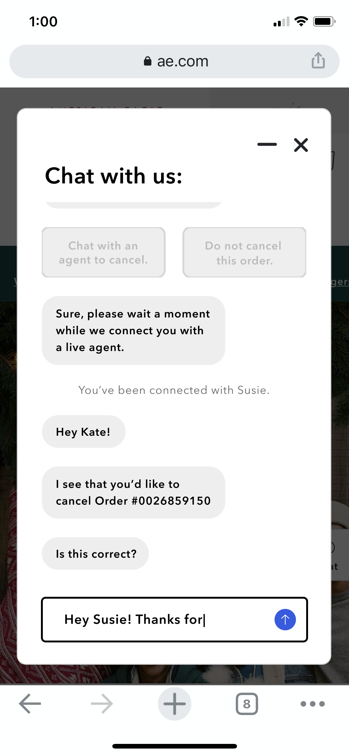
As the network of responses grew, the golden rule held. Never leave the user stranded. Whenever automation fell short, I made sure the path to a human agent stayed seamless, visible, and instantly accessible.
Where It Fell Short
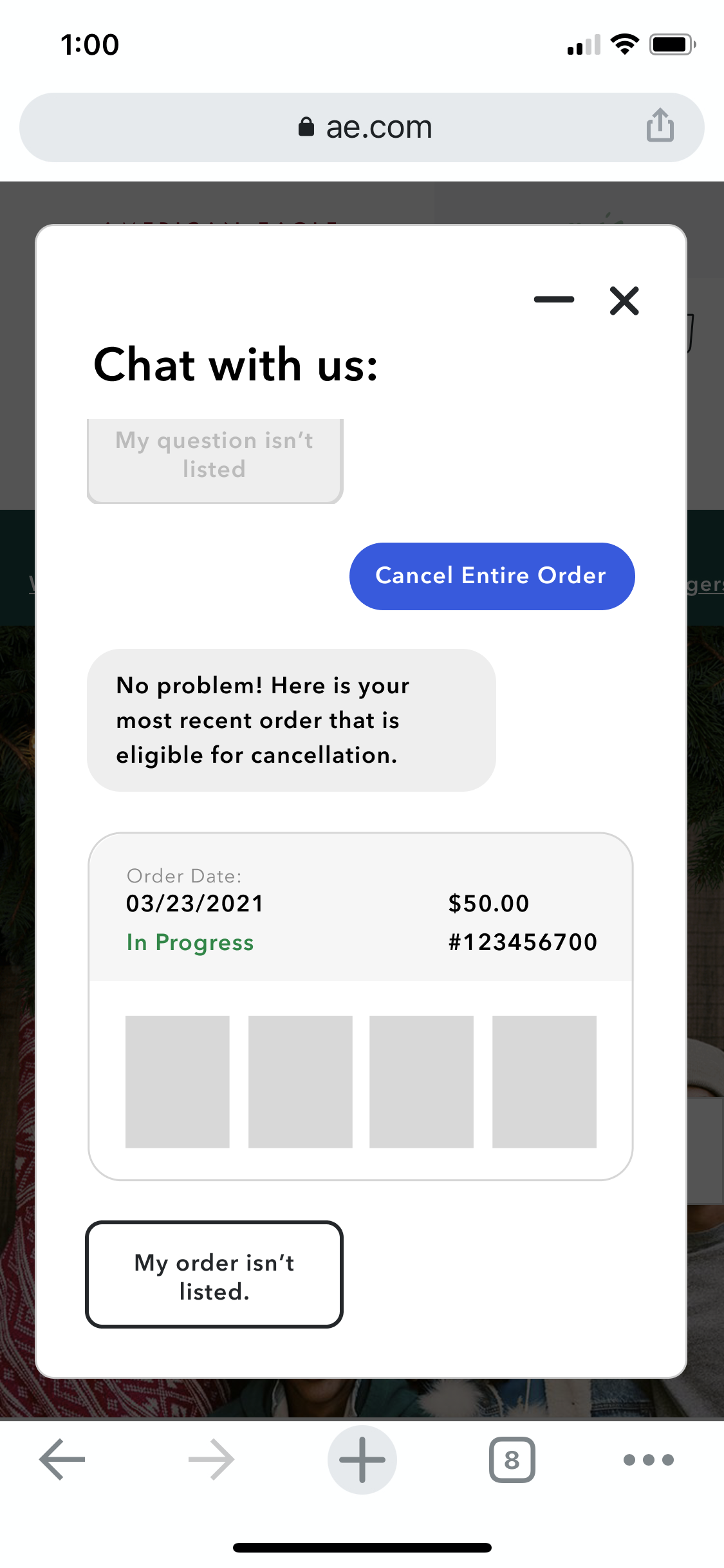
Zero budget shows. There was no personalization, so the logic tree treated every customer the same. Authentication for order-specific help was cumbersome. And the polish I wanted, the UI feedback and micro-animations that make an experience feel alive, never made it in.
It shipped visually basic. But it did the job it was created for, swimmingly, and it bought the credibility that funded everything after.
Key Takeaways
- • A rough thing that works beats a polished thing that doesn't exist. The interactive FAQ wasn't pretty, but it proved the concept, moved stakeholders, and unlocked real budget. I'll always look for that scrappy first move.
- • Making stakeholders feel the logic is more powerful than explaining it. The "choose your adventure" wireframe wasn't just a design artifact. It was a facilitation tool. Putting decision logic in someone's hands changes the conversation entirely.
- • The exit ramp matters as much as the flow. No matter how good the automation gets, users will hit a wall. Designing a seamless path to a human agent wasn't an edge case. It was a core principle.
Strategic Horizon
- • The conversational data is a goldmine that I don't think is fully used yet. Every dead end and repeated question is a signal about where the flow breaks down. I'd build a regular review cycle around that.
- • I'd want to move toward more personalized flows. Right now the logic tree treats every user the same. Someone who just placed an order has a completely different set of needs than someone troubleshooting a return.
- • The long-term play is agentic support: a system that doesn't just answer questions but anticipates them based on account context. That's where this is headed, and the foundation we built makes it possible.
See the experience in action
Explore the automated support assistant flow designed to modernize AE’s support experience and build the foundation for the agentic future.